The first designs for stickers at this year’s WordCamp have arrived, courtesy of Inkfish.
The floor is now open for your comments and suggestions before they get printed. We want you to make these your own and help us produce an end product that you want to stick on your stuff.
People love stickers! They stick them on their car, their guitar and their computer. Mac users are a bit iffy about stickers tarnishing the MacBook aesthetic, but we hope these stickers will inspire Mac sacrilege. PC users are gonna stick these everywhere!
There are:
- Shapely stickers
- Circular stickers
- Name tag and shortcode stickers
We need to pool ideas from you, the community, to ensure sticker designs belong to every attendee at WordCamp this year!
Now these are the first draft sticker designs, and we encourage you to give us your input on these initial ideas. There will be a sheet of stickers per attendee, the idea is to have multiple stickers to choose from and a name tag.
Take a look at what StickerGiant.com did for WordCamp Las Vegas.
Shapely stickers
Smooth and understated, we wonder, can we localise these a bit more?
To the designers amongst us, how do we give these a lekker Cape Town vibe?
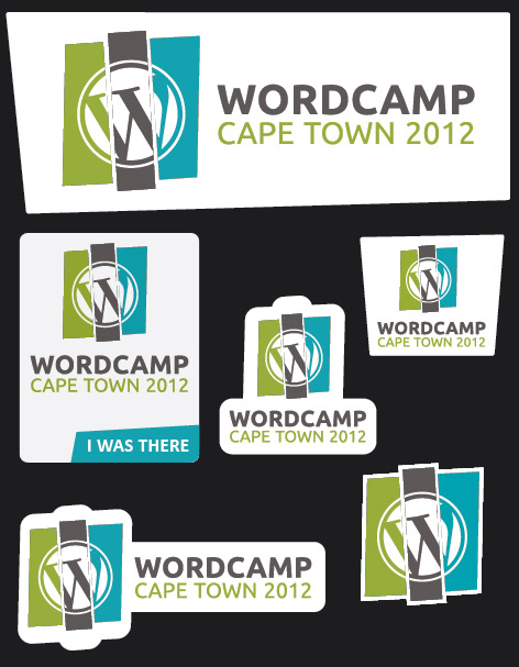
WordCamp Shaped Stickers, Cape Town 2012
Circular Stickers
Designy on the left, buzz words on the right. Discuss… we ARE listening.

WCCT 2012 Circular Stickers
Code and name tag stickers
We think these are going to be very popular. The name inside a tag is on point and stickers based around unconventional shortcode ideas have so much scope for hilarity. Imagine if [free-beer] actually rendered FREE BEER!
Send us your suggestions for more shortcode stickers…
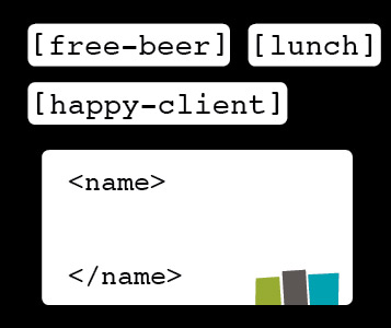
WCCT 2012 shortcode & name tag stickers
Comment below, that’s the way your ideas get realised. The actionable points are…
- Do we need to localise more, if yes, how?
- Do you like the designs or do they need more or less trim?
- Are there buzz words that must be promoted in terms of WordPress?
- Do you like the name tag design direction, can it be improved?
- Do you have fun ideas for unconventional shortcode stickers?
Thanks for the great input we have received about practically every aspect of the event thus far, these things don’t get done in a vacuum and it’s great to be part of a community that gets involved!


The floral circular stickers need the logo to be a bit more prominent? Love the rest. Hope that the isolated logo sticker is big enough to cover up the apple on my laptop cause thats where I’ll stick it 🙂
will definitely work sizing around the apple icon!
In terms of the logo stickers, I like the centre middle sticker, as well as the bottom two stickers.
In terms of the circular stickers, I feel these should be simplified to include primarily the logo (even with the focus on the circular centre of the logo, with the colour bars tapering off to the top and bottom (with just a small strip of the colours showing, to alude to them).
Buzz words and floral print don’t feel like the most appropriate approach to the circular stickers. Perhaps a single design using the logo (as mentioned above) would keep that simple?
I like the name tag idea. The design is fine as well, as it leaves a good amount of space for folks to write (read: scribble) their name. 🙂
The shortcode stickers are a nice touch. Perhaps ones for “volunteer”, “attendee”, “speaker”, etc could be an interesting touch?
In addition, perhaps some more techie stickers in this vein (for example, “do_action( ‘have_lunch’ );”.
I’m looking forward to seeing the end result of these stickers. 🙂
Please don’t make them as big as last year.. not much space left on my mac http://goo.gl/gZDXJ
I agree with Matty in terms of the logo stickers. A nice idea might be to include 3 different versions of the center middle sticker using one colour of the logo for each (excluding the ‘WordCamp” lettering), similar to the stickers in the video.
I feel the ‘designy’ circular stickers could make use of better imagery than floral patterns, perhaps using WordPress-related icons/imagery? Something easily identifiable to anyone accustomed to the WordPress back end.
I really like the code and name tag stickers, there are plenty of cool/humourous options to explore within that concept. An example would be to use common/funny phrases suggested by HTML (as well as shortcodes, although HTML allows for better humour), e.g. my heart.
I like the shaped stickers, looks really good maybe drop in a cliched table mountain outline for the combined top of the 3 colour blocks.
Don’t like the circular stickers design – the flowers. Would rather like it with the same design as the shaped stickers i.e. WordPress Logo with 3 colour blocks in background.
Would be cool if the circular stickers are the same size as license disk stickers with a big ol’ WordPress logo on it.